Help
Quick tips to identify a font from an image, plus answers to the most common questions.
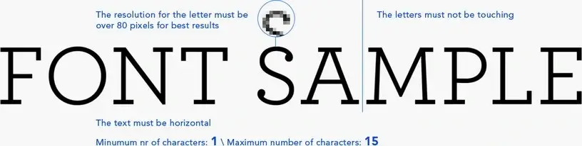
Best image settings (fast results)
- Use high contrast (dark text on light background).
- Keep the text horizontal (no perspective).
- Crop tight around the text (remove margins).
- Use 4–6 characters if possible.
- Letters must not touch each other.
- Higher resolution works better (avoid blur).
Help Q&A
First upload your image in the font finder tool. If the result is wrong, use the link on the results page:
“Wrong results? Post the image to forum!”
Please check How to post to forum.
- Try a higher-resolution crop (avoid blur and compression).
- Use more characters (4–6 is ideal).
- Prefer unique characters (e.g., g, a, R, Q, 2, 7).
- Make sure letters do not touch each other.
If you have free fonts, you can submit them on www.ffonts.net. In about 24 hours the fonts will be displayed on the site.
If you have commercial fonts, please contact us.
Small images miss important character details, so matching becomes unreliable. Use a higher-resolution crop and type only characters that are unique for the font.

Help your fellow font-seekers if you think you can recognize the font. Earn some good karma by doing it :-) Answer & Help

Yet sometimes the images are very complex, so other users need a bit of help.
If you recognize the font from the samples posted here don't be shy and help a fellow designer.
Thousands of designers (famous or not) use the image font detection system to find a font or similar free fonts from an image. Although we have the largest database of fonts, the search for a font from an image gets mixed results like the image above.
Recognize the font? Browse forumHave a font you want to use on the web?
Webfont Generator